Saturday 30 November 2013

lesson 22 flowers


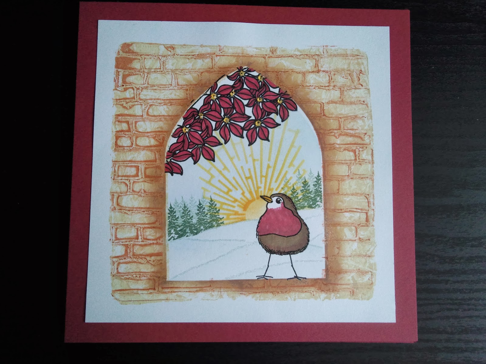
This was one of my cards that I sent in for homework. It was one of the very first ones i made with the stamps.
i started with the gelli backgound. I drew around the opening of the arch stencil on a card and put it under gelli plate.


Then i used buff titanium paint and covered gelli. I squashed a piece of copy paper and dabbed off some paint especially over the arch. Then i put a an arch mask over plate and pulled a print.


 I added brown paint and used the brick wall stencil on top. I removed some paint with copy paper, removed stencil and again put mask over arch and put the first print on top to pull second print.


Then I stamped the large robin in black archival and embossed with clear powder. I also stamped flowers in black archival and clear embossed as well. Hills were created with torn copy paper and inked with clarity brushes. The sun was cutout in the arch stencil and again inked with the brushes. Forest created with small fir tree.
Flowers and robin coloured in various promarkers.
Finally finished off with some frosted glitter to give illusion of snow, and glossy accents in flower centres and robin's eye.

Sorry for the long post. Hope you stayed with me till the end and if you liked it please leave a comment. Hugs Theresa xx


Massimo's homework


Well as those of you who met him now know, my little fellar is very headstrong and will only do what he wants. i showed him stamps and stencil and he decided he wasn't using the tree. He wanted to use woodpecker, flowers and sunshine. So the woodpecker was stamped in black archival and clear embossed and so were the flowers. I then made masks for them as he is not as good with scissors.
He decided where he was putting sun and using ink dusters and distress inks 
(squeezed lemonade, mustard seed and spiced marmalade) he set to work on sun. He loved the finished result and next wanted some hills. He didn't want to use stencil but wanted torn copy paper and that's what he did with peeled paint and an ink duster.
He thencoloured woodpecker with berry red promarker anf flowers with yellow and gold as that was his choice. I was kind of told to stick it down as he finds this bit boring and that was the finished result.

He loves to hear all the comments, so please feel free. Thanks Theresa xx


Friday 29 November 2013

filligraphy stamp


Well today I'm hoping to keep it short. This card was inspired by Jane Telford. I really like these new filligraphy stamps and to me they shout black. 
So I started by stamping the corners of a square piece of card with versamark and embossing in superfine rich gold wow powder. 
For centre piece I stamped and embossed image 3 times using mica boss and then I brushed with mica powders, burnt red, burnt orange and 2 greens: kiwi and can't remember. I mounted layers with pinflair glue for dimension and added glossy accents on central leaf.
I finished card off by matting it on black coated clarity card and gold mirri.

Finished card is 8x8. All for now Theresa xx

Thursday 28 November 2013

christmas baubles


Well yesterday my 11 yr old remembered that he was supposed to hand in some baubles for today. They needed them to sell them at Christmas fair to raise money for Clic Sargeant charity. And what I forgot to say was that the best bauble would win a lot of house points. 
So out came the MDF baubles I had bought at Ally Pally. They had to be green as that is his house colour. So I thought that the easiest way to make them green was to paint with acrylic paints. Some gold acrylic was added for highlights.
Then he wanted them shiny. So I dug out the clear UTEE and he had a blast glazing them. Added a layer of stardust embossing powder for more shimmer.

Green fantage fragments were added to tree while powder was still molten and also the green gems so they stuck down firmly.


It was finished off with gold ric rac for tinsel.
The bauble had thick frantage green glitter added to molten UTEE and glazed over again. It was finished off by a snowflake die cut with 3 layers. The first was glittered in gold, the middle layer was gilded with crafty notions variegated green and the top flake was copper glitter. It was finished off by a green gem.


The 3 glitter stripes are achieved by 'orange' double sided tape.
Lastly came the star. After the first 2 layers of clear UTEE, we added frantage green enamel which is mixed with gold. Some more UTEE was added and a little sprinkle of stardust to leave it with a more vintagey feel. It was then embellished with a poinsettia diecut that was glittered and finished off with a green pearl.


We really had fun making these. I hope you enjoy them and get some inspiration.
We would love to know what you think of our combined effort, Theresa xx

Tuesday 26 November 2013

60th birthday


This was a commissioned card for a 60th birthday and i was asked to use shoes and bags. Well it looks so simple but it took me ages to decide the layout and what i was using.
The upper left hand corner is all kanban die cuts from some stash i had. The lower shoes and bags are kanban stmps used on silver mirri.
The others are spellbinder dies. Birthday is a peel off sticker.
When i was happy with layout i stock it all down after I had added some black glittered ribbon.I finished it all off with some gems.
Finished card 8x8. 
Have a good one Theresa xx

Thursday 21 November 2013

Trees and mantles


Hello again. Today's card is one I made for a friend's birthday. It's a similar technique to what Barbara did on classroom last time.
I started with a piece of water colour card. I spritzed card with water. i then inked the mantle with rusty hinge distress ink and added little bits of aged mahogany and mustard seed. I stamped on copy paper first and then on card twice getting a more faded effect the second time. I did same with the other mantle, but this time I added a bit of peeled paint. The last mantle i stamped in peeled paint. As I had spritzed paper and the inks are water based they ran slightly giving a more mottled effect.
Using potting soil archival ink I stamped the trunks on mantles. I added the slopes with the border stamp on same set. I inked with rusty hinge and dabbed a little mustard seed and peeled paint.
Then using the fab stencil brushes from Clarity stamp, I added some shading at bottom of card with peeled paint. At the top, I added shading with aged mahogany. The birds I drew in brown micron pen.
I matted topper on Tim Holtz co'ordinations craft core card. However the card looked bare like this so I decided to add some twine and jute. I coloured the jute with peeled paint distress ink and spritzed with water for a more even colour. Then I thought that it still needed something as it was still bare. So I thought I could add some leaves from autumn set.
I wanted to use shrink plastic but i'm impatient so I thought I'd try to use promarkers to stamp with. ................And it worked! And it dries a lot quicker than archival. So I cut out 3 of the larger leaves and punched a hole before I heated them. Using jump rings I connected all 3 together and threaded twine and jute through.


Finally I was happy with finished result and it seems so was the recipient!

All for now, Theresa xx


Saturday 16 November 2013

Christmas - Sweet Lilac flowers dt and Clarityblog challenge


Well it's that time of month again when the new Sweet lilac challenge is set. This month it is Christmas.

This was another commissioned card that I was asked to do. A male Christmas card.
All I knew is that i was going to make it on kraft card and it was going to have brown tones. So I had a nice rummage through my Clarity stamps to see what I could make.
The harbour set is one of my favourite sets as it is very versatile. It goes really well with the church set, So out they both came along with the large well stamp.
I started by stamping the roof of the well in lower left corner and then stamped large seagull on top. Next I stamped the two flying seagulls and masked them off. I stamped one row of houses, masked them off and restamped another row.  I used memento brown ink for stamping as I was going to colour in with promarkers. Then I stamped the church and the little boat. I masked all the images so I could work on background.
To create the sea, I scrunched a piece of copy paper and dipped it in versamark ink and used it to stamp over water area. I embossed it with stardust embossing powder. I put a moon mask behind the steeple and set to colour sky and sea with brown tone distress inks and brushes. I used the sepia tones promarkers to colour in the stamped images. Using the fine nib and umber promarker i drew a wall under houses.
For the sentiment I used the banner set and cut out 2 of them. I wrote sentiment inside and added shading with same distress inks. I mounted these on foam pads.
Then I coloured 3 poinsettias from Sweet lilac flowers with the brown promarker and added pebeo renaissance gold gilding wax to stamens and some highlights to leaves. I edged topper and base card with same wax to add to vintage feel.


I matted topper on black card and mounted it on 8x8 kraft card.

Since I used clarity stamps I thought I would also enter it into the Clarity Christmas challenge.

I hope you like my effort as much as the recipient did. All for now, Theresa xx

Thursday 14 November 2013

ink on gelli plate


Recently I've been hearing a lot about ink on gelli plate. Last week when i met Sam Crowe and she was playing with my gelli plate, i saw what she was doing with inks. I thought finally I might get to use adirondaks that i have sitting in a cupboard.
Sam applies ink directly to gelli plate but i used brayer to apply it. The inks were butterscotch, wild plum, eggplant and denim. Before I applied any ink i stamped butterfly from classroom, cut it out and applied it to gelli on opposite side of where i wanted it on print. (remember it will be a mirror image). Then I applied inks and this was followed by stamping.
This part was total experimenting as I didn't know what would happen. I used several Clarity stamps and using coloured archivals by Wendy Vecchi I stamped directly on gelli plate creating a background. When I was satisfied with the stamping I pulled a print. It looks brighter than what you see on gelli plate.
Then i stamped butterfly in area that was left blank aligning it as much as possible. I coloured it with a waterbrush picking up ink directly from ink-pad. I also coloured around it with slate thus creating a shadow.
The little dots are liquid pearls opal white and the glitter is jones tones fine diamantina.
I trimmed print and matted it on black,yellow and black and stuck it on an 8x8 card.
The tag I made from a little of-cut of card. Sentiment is stamped in black archival and clear embossed. Around perimeter i used same stamps and inks as on print. Matted it on black. Ribbon is american sea binding that I coloured with distress inks and spritzed with water. I added some liquid pearls and glitter to it to complete.


I hope you enjoy this and would welcome any comments, Theresa xx

Wednesday 13 November 2013

clarity meets spellbinders


I was asked to make a wedding card and this is what I came up with. I like the idea of white on white for weddings and this is what i start with.
I started with the stately circles die and cut out the first die with GC and then embossed it. With the card still in die i stamped the Clarity lily in versamark and brushed with confetti white perfect pearls. I overstamped sentiment in black archival and embossed with detail clear. I traced around the die and cut with scissors. I inked around with versamark and brushed with confetti white perfect pearls.

For base layer i cut a piece of card 13cm wide and cut the lower border with scalloped borders and embossed. I stamped the 2 clarity sentiments one on upper and other on lower border, in black archival and embossed with detail clear. I then used lattice heart embossing folder and embossed the background leaving a half inch gap from border.
Using american seam binding, I wrapped some around card where I had left gap. I made a triple bow and used a Tim Holtz accoutrements button on knot. I cut 3 sprigs and with card still in die, I inked with versamark an brushed with confetti white. Then after putting topper, I stuck sprigs around bow.
Finally using cosmic shimmer pearl glue i dropped 'pearls' on the embossed hearts on background.
Finished card is A5.

This is another one I made as i was asked for another one the next day. only difference is the button, otherwise same ingredients used.
Hope you enjoy your day wherever you are and thanks for any comments, Theresa xx


Tuesday 5 November 2013

Massimo's homework


This is card that Massimo sent in this time. Although you might think he copied mine, I hadn't shown him mine.
I asked him what he wanted to do and he said it was going to be blue. So i gave him blue distress inks. Weathered wood for snow; tumbled glass, stormy sky, faded jeans and chipped sapphire for sky. He loves the magic of the reveal when he lifts the moon mask. He thinks it's magic and squeals every time.
The stamps are in cobalt blue archival ink.
Once he'd finished he got all upset as he said it looked like winter and he wanted Christmas. I couldn't console him and he didn't believe me when I said Christmas came in winter. If you ask him now he'll say it's not true!
Finally I managed to convince him to ome and put some glitter on the snow and then he thought it looked better. He didn't want a sentiment on though. So I left it like he wanted it.
You should have seen his little face when barb showed it on TV!


Hope it gives you same pleasure to see as it does me when I see his creations. Thanks for stopping by, Theresa xx

trees and mantle clarity homework


This was my favourite card that i made with the trees but unfortunately it was missed. It is a technique i saw Sue Wilson demo on c&c and it is on her blog particraft.blogspot.com. Basically you mask off an area of the card and ink the other parts with distress inks. i used peacock feathers, rusty hinge and mustard seeds. I then added mica powder to inked areas (golden one). Then i removed mask and stamped leaves from the autumn set in versamark. i added mica powder to these (green). Using same leaves, I stamped them again in black archival. I stamped the smaller tree twice in the gap left, after blotting. Then i added the sentiment in black archival,matted on black and on A5 white base card. In real life the card shimmers loads but is really difficult to photograph. 


 Another shot hopefully to see shimmer.
This is inside of card.


This was a shown card that was done with cobalt blue archival ink and blue distress inks: weathered wood for snow; tumbled glass, stormy sky, faded jeans, chipped sapphire for sky. Stamps from lesson 21 and 14. Sentiment is embossed with stardust embossing powder.


This was a second card that i sent in. It is stamped with black archival. Stamps used are from lesson 21 and bauble set. Sentiment is embossed with stardust embossing powder.


Well i apologize for the length of this post. Hope you stayed with till the end. Enjoy yourselves, Theresa xx

Monday 4 November 2013

clarity stencil and homework


Well last month Barbara set a challenge: to see what we could come up with using the stencil that came with lesson 22. Here are some things i came up with.

In the first card i used hills as sand dunes and used distress inks and brushes to colour them in. I used other side of stencil on sky.
I stamped the 3 wise men from lesson 5 and the star and finished it off with the sentiment.


Here i used the same stencil and made trees out of hills. The hardest bit is the masking to make sure that lines are kept clean. Again done with distress inks and brushes. The other side i used to create snowy ground. Dear are from another lesson i think 14.
I added some glitter to finish it off.


This was another topper I made with stencil. Similar to first card. When Massimo saw this he wanted to make one. His is the left one and i think it's better than mine!


This was the first thing i made but i forgot to send it in. I embossed one of the 'hills' using my GC. Then i turned it over to do other side thus creating a bauble. Then i covered all embossed areas with versamark ink using pen and embossed them with red tinsel glitter powder. At the join i added double sided tape and sprinkled gold glitter. I punched a hole at the top and added some twine and a bow.
I finished bauble off with a red poinsettia from Sweet lilac flowers.

I hope you enjoy my post as much as i enjoyed all these makes. Take care, Theresa xx